Appearance
User Interface Design – Rhythm And Feel
Listen to the audio version of this text.
As users get introduced to a new website or application, two things rush to meet them instantly:
- The visual first impression of "where everything is"
- The rhythm of using the program, or "where everything leads to"
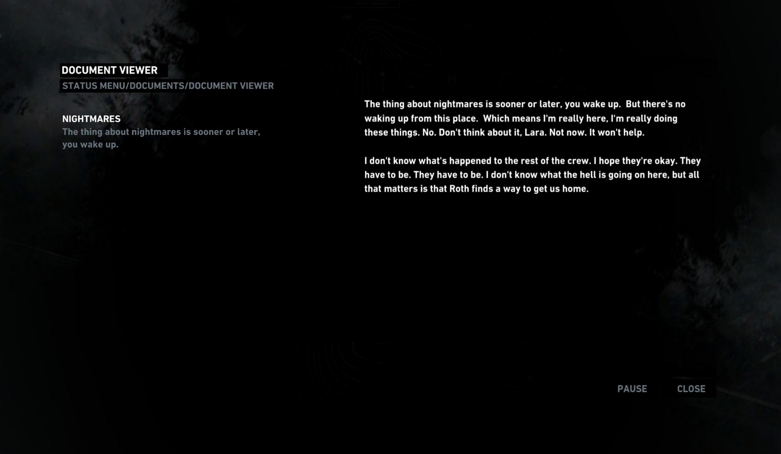
Have a look at this example from the video game Tomb Raider (2013). Notice how the placing of interface elements splits the displayed journal document into a horizontal kind of rhythm:

Here, the conventional top-to-bottom reading of a document has been transformed. The headings are on the left, and the main body of the text is on the right-hand side of the screen. The fonts vary in brightness and prominence, and the headings on the left-hand side occupy the space of what would perhaps typically be a menu or a directory listing.
We can clearly see that this is a particularly customized approach to displaying a document. Impressions on its effectiveness may be subjective, but it is a clear, mechanical example of how the general feel of "where everything is" influences the instinct of the user to investigate "where everything leads to". When designing the Capacic user experience, we always try to keep in mind this idea of visual rhythm. We want to lead the user in the right direction from the start, where they can feel that the website doesn't get in the way of itself or break the user's forward motion.
The Capacic platform provides users with the tools to create the things that they want right there within the platform itself, and we must make sure that their focus won't drift in any unexpected directions. For this reason, we must control the rhythm of using our platform as much as possible.
Our first step to make this happen was to feature very few elements at the top section of the site. We wanted to make sure that the experience of using the website would not have an awkward up-and-down motion at the very top, due to how close this section was to the elements of the web browser itself that frames the experience:

This solution, of course, introduces empty space into the interface. But it is for a reason, as this allows us to then place elements that are interesting and interactive in zones that we want to lead the user towards.
Just as the journal text in Tomb Raider was arranged in a specific way to create a particular rhythm, our vision for Capacic is to take control of the rhythm of a web page to make it best serve the tools we are providing to the user. This kind of approach is very compatible with our minimalist design philosophy, as we work to maximize the benefit of each element and how they are situated in the environment that we are putting together. If "where everything is" is done in a logical and grounded way, it will be intuitive and quick for the user to find "where everything leads to".