Appearance
Effective User Interfaces: Learning From Other Media Genres
Listen to the audio version of this text.
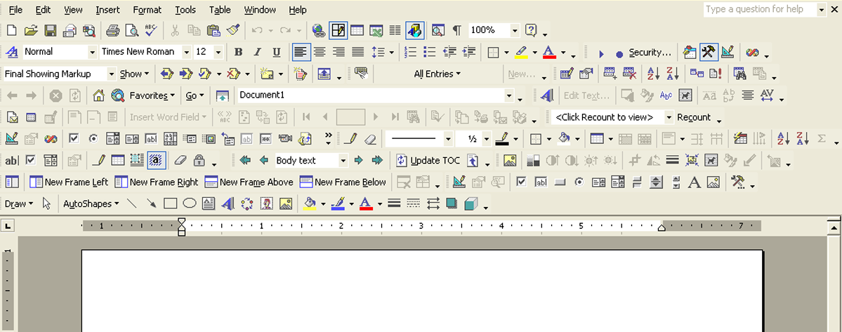
When your vision for your project is ambitious, it is tempting to stuff user interfaces full of functions and menus and go too far with it.
When we want to give the user all that we've got, we can end up making critical mistakes in our design. Things may end up hidden in sub-menus or behind hard-to-find buttons. Even worse, the user may have to scroll the screen to reach important elements when using the application or web environment.

Naturally, the user on the other end would rather have everything they need close at hand at all times. Developers of many different types of digital content have come to realize this.
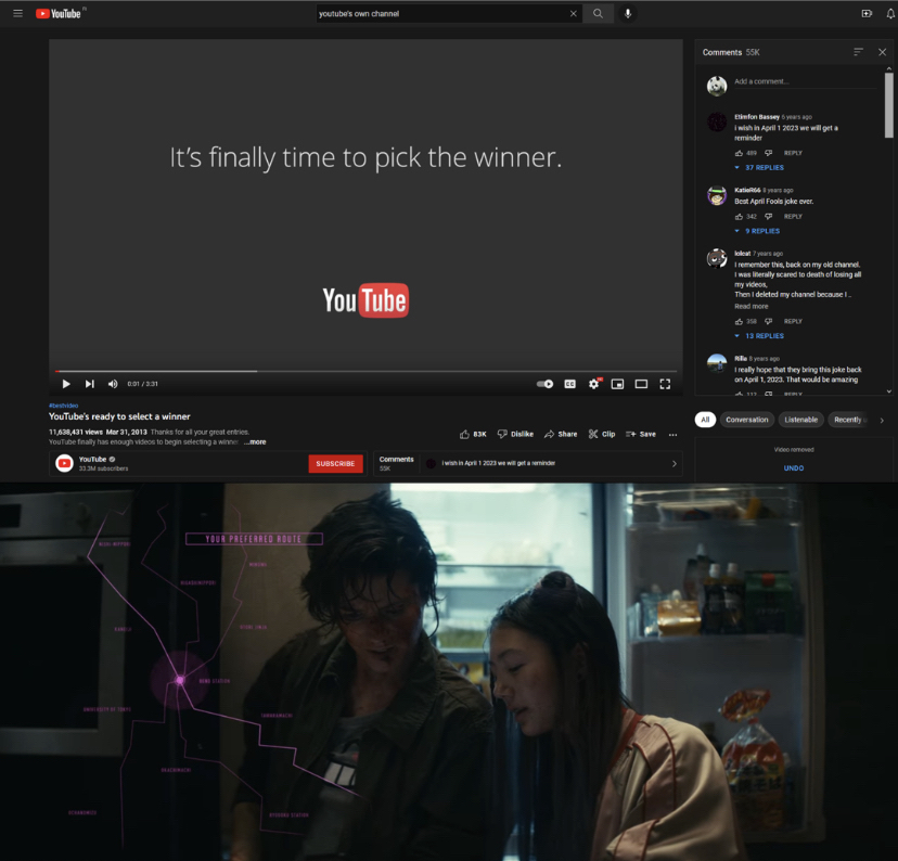
Let's have a look at two different examples of one way to solve this problem:

The YouTube interface includes a small segment at the bottom that brings up the comment section without the user having to scroll and find it for themselves.
Similarly, in the film Kate, we get to see a nicely stylized representation of what the characters are seeing when they are looking at a smartphone screen. We get to keep looking at their reactions without the film needing to change to another camera angle to show what the characters are seeing on the phone screen.
These examples may initially feel very different, but they both use a minimalist approach when deciding what to have on the screen. In both cases, all of the important information is presented on one screen all at once. Everything is only one click or eye movement away, and there is no need for the user or viewer to adjust to a different view to see everything they need.
In other words, these visual texts have all of the resources the user (or viewer) needs, and they are grouped together so that they can all show up on one screen at the same time.
This kind of optimization is key for a fluid user experience. Ideally, the user can utilize most of the interface without having to navigate away from its core.
The need to scroll the screen and hunt for functions and features is minimized (or even completely eliminated when possible). The user is invited to dedicate their focus to a few carefully selected elements grouped together in a logical and intuitive way.
This is an example of combining strong, bold choices with the limitations of minimalism.
Read more about this philosophy here: (Link to the text Creating-Easy-User-Interfaces_Spacing).